ShopDreamUp AI ArtDreamUp

Deviation Actions


Suggested Deviants


Suggested Collections


You Might Like…


Description
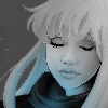
The goal of our assignment was to get peoples attention--and get them to go to that link. A ‘grab you by the throat campaign’ using disturbing or powerful imagery and no information but the greenscape.com link, leaving the viewer uneasy and with nothing to go on, but to go to the link, where they will find the podcast about living greener so we can ‘escape’ this dark future that we have a nice foothold on.
I tested this campaign with a group of people to see if having more positive imagery would have the same effect as the gruesome and more negative imagery, but people still chose the negative image as being the one where they would want to find out more.
The Campaign includes (and shit I still gotta do)
TV ad (storyboard),
Magazine ad (3)
Billboard transit ads (One for inside the bus, one for the shelter)
I am actually somewhat proud of this, I haven't done a lot of photomaniulation before, so I decided to take a stab at it.
Yes!
Image size
1500x714px 346.3 KB
© 2008 - 2024 Ashwings
Comments58
Join the community to add your comment. Already a deviant? Log In
the three work real good together, looks good  (Smile)")